Wednesday, December 28, 2011

Happy Holidays and a cool new toy

Happy Holidays! I hope you and your family and friends are enjoying some down time and togetherness.
Well, I fell way off the blogging band wagon for a while. Sorry about that, life just got too busy.
So, I’m going to tell you about my holiday cards. Yes, I got busy with my Etsy shop, but this year I was a little better prepared, and worked on the cards in a brief slow period sometime in Nov.


The design was swiped from an Archiver’s flyer that I got in the mail, but with my own twist. I rarely ever use the traditional red and green colors for my holiday cards. Mostly because by the time I get around to doing them, all those colors are sold out, so I get something else. I really like kraft paper too, and for several years my cards have had kraft paper used, one way or another. I should do a series on that. Anyway, I found the nice plaid paper and really liked it, and guess what, it was on clearance too.
I’d wanted some sort of gingerbread man image for the tag, but couldn’t find a stamp, sticker or anything else that worked, so, I opted for the star. It was a stencil that I had and I just used an ink pad to ‘stamp’ the star. I experimented with pastels, but this worked best for what I wanted.
All the years that I’ve been doing calligraphy, I’ve been pretty anal about drawing or having guidelines so that I’m sure the lettering is straight. The kraft paper was too thick and dark for me to use on my lightbox, and I didn’t have time to rule each card, so, gulp, I did the lettering freehand.


The lettering is a bit difficult to see what with the pink on the kraft paper, so I’ve tried to lighten it at bit. Some of them look really straight, but some of them went a little crooked. Oh well, that’s life, and I need to practice without lines a lot more, for better results next time.
Evie is almost 3, where did the years go? One of her presents from Santa this Christmas was a toddler version on the Spirograph®. My parents brought me my old Spirograph a few years ago, and I actually used it to create my Holiday cards that year, it’s a fun drawing tool, I wonder if they still make it? Anyway, Evie’s is battery operated and spins for you. She liked the spirals that it made, but then moved onto freehand, letting it spin while she drew. I resisted this, but realized she was being creative and I was having fun with it too. She blew through the 12 sheets of paper that came with it in 2 days, and I’ve been cutting new sheets from some very old, slightly yellowed, drawing paper that my Grandmother had. We’re gonna need new markers soon too, I think.
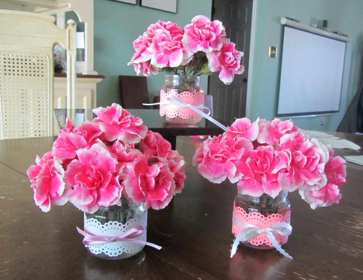
I don’t have a great photo of it, but I’ll get one to post soon. In the meantime, here’s a little of the Christmas aftermath....


I’ll post some of her artwork soon too. I promise.
Until next time.
Jen

Tuesday, July 26, 2011

Family reunion T-shirt design

So, we are getting ready to leave for a weekend at Virginia Beach. It's what I have been calling a 'mini' family reunion, since it's just us cousins attending. My sister thought it would be neat to make matching T-shirts for everyone. At the time of the original idea I could have had them printed, but life got in the way and I ended up making them.

First I looked for a clip art design that I could alter and add to. I found a couple possibilities, then I created the lettering.

I did the lettering with a folded ruling pen and a Mitchell #4 or 5 nib. I used the colors that I used in the clip art design and Dr. Martin's Tech inks. Dipping in the different colors so they would blend a little.


Next I had to scan the lettering in and manipulate it in Photoshop. The clip art was an Illustrator file that I saved as an eps so that I could open it in Photoshop. I won't get too technical, but here is the final design.


I had purchased white T-shirts for $2 each at Michaels when they were on sale last week. I also used an iron on transfer paper for light fabrics by Jolee's. I was skeptical but had little time for experimentation. The directions said to use an inkjet printer and then iron them on. It was great to load the design onto the Jolee's Website and print from there, because it automatically reversed the design so that it would be right reading once ironed on.

This is the result.


Overall, I'm pretty pleased with how they turned out. The color is great, the lettering and clip art seem to match pretty well, and it was pretty easy to do. Just a little time consuming, but all in all I did the shirts for about $3-$4 each. I can't wait to do our group photo on the beach, oh and thank goodness I only had 18 to do. Ok, 19 since I messed up and got one wrong size shirt. Ugh.

Until next time. Jen

Tuesday, June 14, 2011

Escort cards vs. Place cards

Ok, it’s a little embarrassing admitting this, but, lately I’ve noticed brides asking about my doing escort cards. Well, yes, of course I do them, I just have assumed that meant place cards. Then a recent bride had both! I finally had to ask her when I met her what the difference was.
Evidently, escort cards are a card with a table number on it, which is then placed into an envelope with a person or couples name on it. These would be available for pick up at the cocktail portion of the reception.
Place cards are the usual tent (ie: fold in half) cards that are placed at each place setting at the table.
Here are the escort cards and envelopes and place cards that I did for this bride. The font style is Bickham and the lettering was done in navy blue acrylic paint/ink. I love the little pair of gold birds on the escort envelope.


On the agenda for this week: Another wedding job to do, addressing this time. And, I have these creative jewelry ideas in my mind that I need to act on, otherwise, I’ll just keep dreaming about the designs.
Until next time.
Jen

Friday, June 3, 2011

Hair bow hanger #1

It’s been a busy week. Holiday camping for the Indy 500, then out of town family visiting for the week. We have been to Kings Island twice, the zoo and we’re going to Summerfair this afternoon. So, I haven’t had a lot of creative time. I started this a few weeks ago. One of my 2 ideas for a hair bow hanger for Evie’s room.

I haven’t made any more hair clips for her, but I realized that I needed a better way to store / organize / show off the bows. Here are the colors of her room that I was trying to match. Basically, pink and green with lady bugs.


I’ve seen bow hangers at a lot of stores and online, and they all pretty much look the same and easy enough to make. So, I put my twist on the idea and came up with this hanger. 


I have some heavy aluminum wire from my jewelry making supplies so I made a miniature coat hanger, and attached a ribbon to it. Simple. The whole thing is about 18 inches long, maybe a little too short, but I have another idea brewing.


If you need something to do this weekend, I highly recommend going to Summerfair  www.summerfair.org. Lots of wonderful art work to purchase, a kids area, food and music.

Have a great weekend everyone.

Jen

Monday, May 16, 2011

Place cards and a dress for Evie

Just a touch of calligraphy this week. I did some place cards for a client in Baldwin, NY. I love getting work from all over the U.S. and my Etsy shop has helped me do this.
But, I think the project that I’m most proud of is a dress that I made for Evie.
My old hand-me-down sewing machine, circa 1959, jammed last year when I was making a pillowcase dress for Evie. So, Jeff’s aunt gave me a new hand-me-down sewing machine, circa 1969. I moved up 10 years! 


I bought the materials more than a month ago and I’ve been antsy to get working on it. My basic idea was to take a T-shirt, cut off the bottom and add fabric for a skirt to make an empire-style dress.
Preparation was to wash the T-shirt and material. I took the half yard of material, folded it in half, to find the center and marked it with a pin. Then I sewed basting stitches to pull into gathers to fit around the T-shirt. Next I sewed the side seam of the material.


I measured up 7 inches from the bottom of the T-shirt and cut it off about a half inch below that line.
The hardest part was figuring out the inside out, right side, wrong side way of pinning it together so that once sewn, the seam would be on the inside of the dress. Trial and error, and I finally figured it out, but don’t have a photo of that.
So, I sewed it together. Next was figuring out how to decorate the front of the dress. I used a square of the material for the base, which I ironed on instead of sewing. Then, I cut a strip of the T-shirt material and gathered it to make a flower shape. Next, I went to my stash of old/vintage buttons that I’ve had for years and looked for something for the middle of the flower. I found this cute little fish shank button, and sewed it on through the flower.

Next, I hemmed it, and Viola! Here is Evie wearing the finished dress. It's a little big, but I want her to be able to wear it next year too, maybe. If it survives this year.


Thanks for reading, Jen


Friday, May 6, 2011

Whew! All caught up

Whew! I am all caught up on calligraphy work and other freelance work. Quick, do something fun.

So, I did.

My toddler just will not keep a bow clip in her hair. As soon as I put it in, she grabs it out. Only if she is distracted by something else will it stay in for a few minutes. Like in this photo from Easter. Hunting eggs was more fun than than thinking about her bow.


Ok, please ignore the weeds and my hubby video-taping.  I'm slowly working on the weeds, but it has been raining here constantly for weeks.

Since she's so good at pulling the bows out, we've lost a few, one last week was lost at Kohl's. So, I decided to see if I could make some bows. They look really easy and I figure I can make some to match her outfits. After doing some online research, I bought some clips and ribbon and fired up my hot glue gun. This is the result.


Another project that I tried was this flower pin.


I found the directions for this on another blog that I came across. The directions were super easy to follow. Here's the link if you'd like to make one. http://obstinatepursuit.blogspot.com/2009/07/fabric-flower-tutorial_03.html


This week I also made Mother's Day bracelet & earring sets for my Mom and Aunt. This is the prototype that I made for myself. The flat discs are a shell of some sort and I've accented them with silver daisy spacers, and Montana blue Swarovski crystal bicones. My aunt's set was in tones of brown/cream with gold accents, and my mom's was black/white/silver. Now, something for my mother-in-law....hmmm, I'll come up with something.

This ended up being a pretty crafty week. I need to get back to some calligraphy fun, and I'm way behind on Evie's scrapbook. I haven't added any pages in over a year. Next rainy day....

Happy May!

Jen

Monday, April 18, 2011

April showers bring, well....moisture

Spring, it’s finally making it’s way here to Southern Ohio and along with that comes the rain. And our damp / wet basement where my studio is located. Last year, as I was crazy busy in wedding season I suddenly realized that I had a moisture problem and it was affecting the gum on the back of the envelopes. Everything was sticking together and I was panicking. Luckily nothing was ruined, but knew I had a problem that needed addressed.
I asked my hubby to get a de-humidifier to run in the basement. He nixed that idea because it would use too much electricity, almost like running an air conditioner all the time. He’s the one with the certificate in green energy, so I had to listen to him, although not happily.
So, I had to get creative. And here is what I’m doing. First, I am storing envelope jobs that I’m working on in Tupperware® type containers. Second, along with that I put in little packets of silica gel pellets.

You can buy them in the floral dept. of craft stores. I got this 1 1/2 lb. bag at Hobby Lobby for $5.99. (Use one of their 40% off coupons and get it for less, like I did) The pellets are used to dry flowers, and are clear, but they put colored ones in so you can see when they need refreshed. When they have soaked up all the moisture they turn pink. In their dry state they are blue. I put the pellets into pretty little organza bags, and check and change them as needed every day or two while I’m working on a job. 

This photo shows the fresh pellets in the organza bags and what they look like when they need refreshed. 


When they are all pink, I put them on a cookie sheet in a 250 degree oven for about 45 minutes. They turn blue again and are ready to use, after cooling, of course. 


This photo shows them fresh from my oven and this is almost the entire bag.
Sorry it’s been a while since my last post, I skipped the entire month of March and almost all of April. Ooops. Anyway, gotta get back to work and finish more envelopes.


Evie antics: She is a real outdoor girl. These nice afternoons right after her nap and a cookie break we head outside to play. I try to pull weeds in the landscaping and she helps by giving me handfuls of our landscaping rocks.
Thanks for reading.


Jen

Sunday, February 27, 2011

Every now and then...

...you get an envelope job that is problem-matic. I’ve dealt with many difficult issues. Dark envelopes that I can’t use my light box and templates, bleeding envelopes, rough hand-made paper envelopes. Over the years I’ve found ways to resolve all these issues to complete the jobs.
Well, last week I got a job that tested my abilities. I was told that they were ‘kraft’ paper envelopes, so I anticipated them probably bleeding. So, I tested one. It was like writing on a brown paper sack from the grocery store, and yes, bleeding like crazy. My normal fix for that is to spray them with spray fixative, so I sprayed all of them. Still bleeding. Hmmm, sent out a question to a few of my calligraphy colleagues to see if they had any other suggestions.
Someone suggested hair spray and adding a few drops of gum arabic to my navy blue acrylic ink, another couple suggested powdered sandarac. I’d tried the later while waiting for a response, and had no luck. So, I tried the hair spray and gum arabic, luckily we had an old can in our medicine cabinet in our bathroom. I hadn’t used hairspray in years, anyway, gave an envelope a good shot, let it dry and tested it. Viola, it worked! Now, I did go out the next day and buy a new can, and it seemed to work even better. I hope the bride didn’t notice the distinctive scent of hairspray.


Oh, and did I mention that these same envelopes required pointed pen lettering, and the pen would pick up fibers of the paper? And, did I mention that I couldn’t see through the envelopes, so each one had to be ruled? Lastly, did I mention that there was a nice letterpressed image of coral on the bottom front of the envelope requiring my planning the address around it? Whew! 
I guess the only good thing about it was that there were only 50 to do. And thank goodness the table and escort cards are on a nice ‘regular’ paper, as I will be finishing those up in a couple weeks.
Evie antics: She’s started saying and identifying colors. So far, yellow is the clear favorite, but ‘bu’ is a close second. Hey, those are my college colors! Go Eagles!

Until next time, Jen

Sunday, February 13, 2011

Valentines and other work

There were a few Valentine’s floating about the studio this week. But, more on that later.
A friend on Facebook referred another friend to me. She had been at a Chamber dinner and the speaker was very inspirational, so much so, that she wanted one of the woman’s quotes done in calligraphy. It’s a great quote, really.
"If I am going to drown I don’t want to waste time in shallow water."  — Clara Arbiser
I wrote this out a couple times on gridded layout paper, and my muse must have been with me because I was happy with the lettering right away.
Now, for colors, I made some suggestions to the client after I took some inventory of my massive stock of paper. The obvious imagery would be to use blues, but the client also wanted to incorporate some of the lady’s personality into the piece. She is from Argentina, and was very vibrant and passionate, and wearing the color red. So, I suggested doing the lady’s name in red, but much smaller to not over power the other wording.

I chose a piece of paste paper that had bold blues and greens with subtle spots, from what, I’m not sure, but thought it could look like drips of water. The client really couldn’t visualize the white lettering that I suggested, so she wanted a more subtle blue for the paper. So, I chose a plain light blue paper and did the lettering twice. On one of them I added some pastels to look like calm water. I also did the white lettering on the paste paper just so my client could see it.

I scanned all three examples, and sent them off to the client to see if she liked one of them. She liked more than one and wants to have 2 of them, the paste paper with white lettering and the light blue one with the pastels. Bingo! But, I’m just glad she liked my work. This has happened more than once for me, so I’ve found that it’s always a good idea to give the client choices.

As for the Valentines, I made some simple cards that I saw a design for at Archiver’s this time last year. It started out that I just wanted to send a couple to my nephews from Evie. But, ended up making them for other family members to thank them for their baby sitting services.

Then I had a thought of a use for all the baby food jars that I saved after Evie was finished with them. Broke out my doily punch, (see my last blog post for more on that) and made strips to wrap around the jars, tied a ribbon around it, added flowers and viola, Valentine bouquets. They look very spring-like, don’t you think? And since it was almost 60 degrees today, we can only hope that spring is right around the corner. But, personally, I'd like a few more pretty snow days to cover all the gray & brown of the trees and grass.
Happy Valentines Day!

Thursday, February 3, 2011

Evie’s 2nd Birthday Party

I love playing with paper and paper products. Every year, except this one, I make handmade Christmas cards to send out to family and friends. So, naturally, I want to do the same for Evie’s birthday invitations. I’ll do it as much as I can until she asks for Dora invitations or something else.
So, how do I start out? I think about the cool things I have that I want to use. I have a really cool doily punch by Martha Stewart so I started thinking about how I could use that to incorporate into the invitations. So, I punched a strip of white paper on 2 sides to make a doily strip. I used an almond colored paper for the base of the card, but also wanted to add some ‘girly’ pinks or other colors. Ok, I cheated on the writing here. I used a cool set of alphabet rubber stamps on the lace strip to say ‘Peek a boo, look who’s turning.’  Then I hand cut the number ‘2’ out of Japanese origami paper, and added the flower. 

I printed out the words of the invitation on a white paper to insert inside the invitation. I used the doily punch on the top and bottom edges and added a cute little photo of her and tied it all together with some string.
Done, mailed them out.

Next up, the cupcake picks. I remembered that I had bought some cool doily stickers at Big Lots last year. I had intended to use them in the design of a wedding invitation suite that I did last year, but the bride wanted to go in another direction, so I have a bunch of them. I just needed to find them in my, let’s just say, temporarily disorganized studio. I figured the best way to find them was to start putting stuff away, and it worked. Just as I was about to give up, ta da! they were found.

I used a 1.5 inch scallop punch in the almond paper, topped that with a pink circle, the doily sticker on top of that and the final touch, a gem in the middle. Glued them to sticks. Done. Note: I was asked a question on how I attached the sticks. First, they are kabob skewers that I cut into thirds or approx. 3 inches long. I used a hot glue gun to attach them and did not have something on the back to cover them. As an option you could do that if they were going to be viewed from both sides.

Last year I had wanted to make a window banner, but time ran out, we had a death in the family and her party was very small, so it got skipped. More time this year, so I had to come up with something to match the rest of the paper products.
I went to one of my favorite scrapbook stores, Archiver’s, and bought a package of 10 scalloped edge 5 inch circles. I cut a 4.5 inch circle of the almond paper. Then, at another favorite store, JoAnn’s, I bought 4 inch paper lace doilies and layered it all together. I punched a bunch of white scalloped edge circles and then did brush lettering on each individual one. I didn’t think ‘Happy Birthday’ would fit, so I opted to write ‘Evie is 2’  The space between the words have a stamped flower and a paper flower on top of that. Lastly I punched holes in each side of the large scallop and tied them all together with 1/4 inch organza pink ribbon, added long tails on each end to hang across the window.

Luckily, I had almost all of the paper products that I used, saving me some $. All I bought were the large scallops, paper lace doilies and some ribbon. Today I re-purposed the leftover cupcake picks to use on the thank you notes that I need to write. I had fun making all of these and hope I can catch up on my scrapbooking and use all these fun items for her 2nd Birthday page.
Evie antics: She had the most fun with the helium balloons and the puzzle that her grandma sent from Georgia.

In the studio: For the thank you notes, I had a whole box of small envelopes that had gotten moist and the flaps were sealed. I didn’t want to toss the whole box so, I sent a question out to my calligraphy friends on Facebook to see if anyone had some advice for salvaging them, besides steaming. I steamed a few open, but it was tedious, time consuming and dangerous with the hot steam. The envelopes also look a bit worn from the process. One of the ideas that was sent to me was to put them in the freezer for 24 hours. I was excited to try this as I thought it might work. Sadly, I just took one out and tried to get the flap unstuck, it sort of worked. Parts of it came undone, but the rest tore. Not the result I wanted, but hey, worth a shot. I’ll try the steaming with a hot iron and damp cloth next, but if that doesn’t work, they will be tossed.

Thanks for reading. Jen

Wednesday, January 26, 2011

Getting ready for the Guild’s 30th Anniversary Exhibit

The Greater Cincinnati Calligrapher’s Guild is celebrating 30 years in existence this year. In Nov. we had a wonderful dinner party to celebrate, and to cap this off, the guild will be having an exhibit of wonderful calligraphic artwork at the downtown Cincinnati Library starting Feb. 1 through March 10.


By the way, I designed the logo we’ve been using for all the anniversary events.
I had a deadline to deliver my pieces of artwork in mid Dec. One of these pieces was started in May, and was shown as an example at several guild meetings as a ‘work in progress.’ So, it was finally time to finish it.
The piece was started in Jacqueline Sullivan’s Wet and Wild workshop. I was workshop chairperson and coordinated putting this workshop together. It was touch and go with this workshop between getting enough people to attend, to having to change the venue the week before the workshop. But, that’s whole other blog story for a later date.
The background of the piece was made by pouring watercolors onto the wet watercolor paper. While the paper was still wet we could do some other things to it to move the color around, but really, there was no control of how the paper would look in the end. It was very freeing to just keep creating papers and experimenting with different techniques to see what happened.


This particular piece has the effects of sprayed on rubbing alcohol, as seen in some of the whiter areas. Also used was a sprinkling of dry Rit dye that shows up as dark spots on the bottom.
Once the paper was dry we went about layering different coordinating pieces to build up the piece and plan where lettering could go. Now, I had taken this workshop before, so I knew some of the tricks and techniques already. Using foam core to raise the layers off the background, remembering to use the ‘odds’ rule to make a piece more interesting.
I’m not sure what my thoughts were regarding choosing the quote for this piece. I had done that quote before, so maybe thinking about leaves and the green color of the piece, may have contributed to my decision. I recall that I did a couple different styles of lettering before deciding on the all caps variation of Italic. I used navy blue Ziller ink for the lettering and the word ‘Life’ is done with Pan Pastels, which I love using.
To finish it off, the piece is framed in an oak shadowbox frame. I had contemplated spray painting the frame a gold/brass color to match the gold in the piece, but ran out of time. I still might do that at a later date. Maybe I should have everyone vote.


Although I posted the end result in my Fresh Art album on Facebook. I wanted to share some behind the scenes insight into this piece of artwork.


Lastly, if you are in downtown Cincinnati, stop by the library during their business hours to see the exhibit. I have another fun piece in the exhibit entitled 'Now I Know My ABC's' Can you guess my inspiration for that piece? This exhibit will definitely show that calligraphy is more than just beautiful handwriting, it is an art form in itself.


In the studio:
I’ve been busy working on paper products for Evie’s 2nd birthday party which is this Sun. Can’t believe my baby is turning 2. Invitations, cupcake picks, and a banner for the window. I’ll show them off in another posting soon. 


Evie antics:
Her Dad downloaded a new app for her iPad. It’s a Dora Coloring Adventure. You choose the picture, add stickers and color it in by touching a crayon color and touching the screen. She got the hang of it really fast. She likes making everything a monotone and lots of stickers.
Until next time, meanwhile ... Go Steelers! Stairway to Seven....
Jen

Tuesday, January 4, 2011

Happy New Year!

My latest musings...
I started the year off right, got my butt in gear and started and finished my first wedding job of the year. I’ve had it sitting in my studio since early Dec., and had promised the completed job by the first week of Jan., taking into consideration the holidays. It was a small job, only 51 address, so I completed it in about 2 days, with some babysitting help from the hubby. Or as our friend, Melissa, calls it, “parenting,” when it’s your own child. The lovely bride and her family are from just up the road in Springboro, Ohio. This was a reject envelope since the zip code was incorrect. A great resource for checking zip codes is www.usps.com I've used that site many times when a zip code is in doubt, incomplete or omitted from a wedding list.

It was nice to do some mindless practicing of a font that I know very well. The Bickham font. I even worked on perfecting some of the letters that I’ve formerly had issues with. The paper was nice and I started the job with a new nib, a Hunt 56, and my usual black Sumi ink. This is a print sample of the font.

As for resolutions for the New Year, well, can’t say I’ve verbalized any, but have a few things in my head that I’d like to get accomplished. Lose about 20 lbs. to start. But, as always, try to have more time to be creative. That could take many forms, calligraphy, jewelry making, playing with Evie or even writing this blog. I already have a few more article ideas brewing for upcoming posts.
Evie Antics: I thought I’d share this photo of Evie playing with one of her presents from Santa, an Aquadoodle. I’m trying to get her started on her creativity too. Oh, and she's using her right hand, which is rare, since she usually colors with her left hand, so I can't decide which it's going to be.


Until next time....Jen